


VERAGGIO · 2021
Descrição
Para além de uma indústria, uma ponte entre tradição e modernidade.
Veraggio produz massas autênticas italianas. Equipada de matérias primas e utensílios tradicionais, se contrasta e se mescla com o mundo contemporâneo.
Suas composições visuais criaram-se entre comunicar um alimento corriqueiro do dia-a-dia e a necessidade de uma expressão elevada e verdadeira. Desenvolver essa marca foi fazer presente o passado e a tradição; externalizar uma linguagem singela, elegante e atemporal.
Unir essencialidade à alta qualidade, pela ótica da produção visual, Veraggio. “Buon appetito a tutti.”
O que é o projeto?
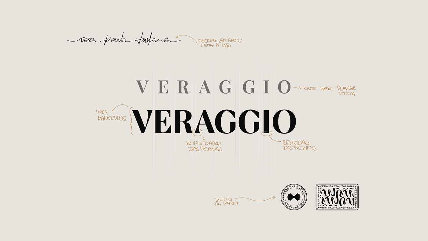
Buscando um design tradicional para o projeto, o logotipo da Veraggio foi construído com base em tipografias renascentistas dos letreiros de “ristorantes” italianos. Foram removidas as serifas para estabilizar tradição e modernidade.
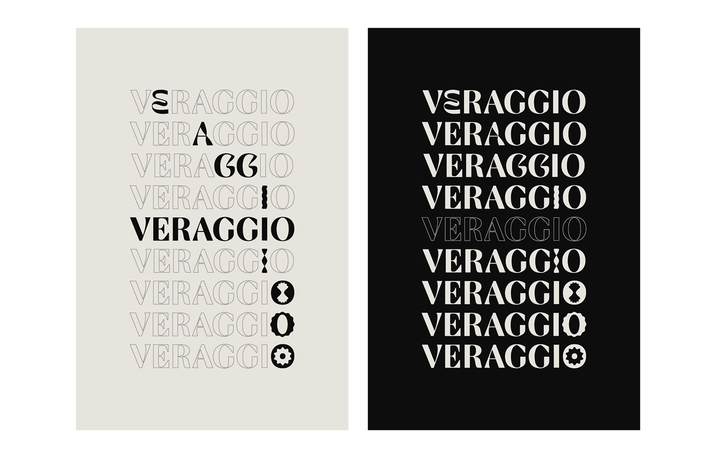
Criando o logotipo e vendo as variadas formas das pastas, concluiu-se a necessidade de mais expressão. Obtivemos um logotipo e oito variações, cada uma podendo ser filiada ao produto ou narrativa dominante.
Já nos elementos de apoio, a inspiração na imagética italiana se fez presente. Janelas em formato de arco deram forma à janela da embalagem. Arremates ficam por conta da iconografia, sinetes e assinaturas.
Nas cores, o simples preto e branco inspira lisura, o amarelo destaca como a cor da massa e o vermelho e verde complementam composições expressivas.
Qual o objetivo?
Em Santa Catarina - uma região onde a descendência italiana está muito presente -, as pastas encontradas em restaurantes e mercados não são autênticas, tornando pouco acessível oferecer a real experiência gastronômica italiana para seus consumidores. Desse berço, surge a Veraggio (“vera” e “lignaggio”; “verdadeira linhagem”). A indústria se diferencia em um mercado inverídico com o objetivo de tornar acessível pastas italianas de produção original.
Buscando a imagem de um produto elevado e artesanal, iniciou-se a criação do design de marca. Foi crucial expressar a verdade de um produto excelente por essência, extrair e narrar seus símbolos, criando assim uma prosa visual que conta sobre um alimento tão bom que se tornou casa, se tornou lembrança, se tornou família.
Defesa
O projeto da Veraggio foi executado com rigor técnico e descarte de excessos. O foco maior foi a atemporalidade; atender a indústria do presente, trazendo um design que funcionaria no passado e que também funcionará no futuro.
Baseado em feedbacks da fundadora, o design conseguiu transmitir com exatidão a tradição italiana. Cumpriu-se o resultado de potencializar a imagem do produto, sendo avaliado com valor elevado de mercado, diferente das demais massas industrializadas e verdadeiro ao olhar dos clientes finais.
Num mundo contemporâneo em constante mudança tecnológica e social, o que perdura não possui alarde, mas possui poder. Comer massa é tão palpável, tão nítido que surge de nossas memórias na forma de nostalgia; da emoção de viver e reviver uma experiência prazerosa e feliz.
-
Description
Beyond an industry, a bridge between tradition and modernity.
Veraggio produces authentic Italian pasta. Equipped with raw materials and traditional utensils, it contrasts and blends in with the contemporary world.
Its visual compositions were created between communicating an everyday food and the need for an elevated and true expression. To develop this brand was to make the past and tradition present; externalize a simple, elegant and timeless language.
Combining essentiality with high quality, from the point of view of visual production, Veraggio. “Buon appetito a tutti.”
The project
Seeking a traditional design for the project, the Veraggio logo was built based on Renaissance typographies of Italian “ristorantes” signs. Serifs have been removed to stabilize tradition and modernity.
Creating the logo and seeing the different shapes of the pasta, the need for more expression was concluded. We obtained a logo and eight variations, each of which could be affiliated with the dominant product or narrative.
In the support elements, the inspiration of Italian imagery was present. Arch-shaped windows shaped the packaging window. Finishings are on account of iconography, seals and signatures.
In terms of colors, the simple black and white inspires smoothness, the yellow as color of the dough and the red and green complement expressive compositions.
Objective
In Santa Catarina - a region where Italian descent is very present - the pastas found in restaurants and markets are not authentic, making it difficult to offer the real Italian gastronomic experience to its consumers. From this cradle, Veraggio emerges (“vera” and “lignaggio”; “true lineage”). The industry sets itself apart in an untrue market with the aim of making original production Italian pasta accessible.
Seeking the image of a sublime and handcrafted product, the creation of the brand design began. It was crucial to express the truth of an excellent product by essence, extract and narrate its symbols, thus creating a visual prose that tells about a food so good that it became home, became memory, became family.
Defense
The Veraggio project was created with technical rigor and excesses were discarded. The main focus was timelessness; serve the industry of the present, bringing a design that would work in the past and that will work in the future.
Based on feedback from the founder, the design was able to accurately convey the Italian tradition. The result of enhancing the image of the product was fulfilled, being evaluated with high market value, different from other industrialized masses and true to the eyes of end customers.
In a contemporary world in constant technological and social change, what lasts has no flaunt, but it has power. Eating pasta is so palpable, so vivid that it emerges from our memories in the form of nostalgia; the emotion of living and reliving a pleasurable and happy experience.


―
Agência Mangu Brand
Equipe de criação:
Novo negócio: Gustavo Beffa
Naming e Gestão do projeto: Amanda Lume
Identidade Visual: Felipe Sol


